Logan Together
Logan Together is a not-for-profit organisation that helps service providers, community members, and professionals work together to improve the development of kids in Logan, Queensland.
They needed a website that was more organised, easier to manage, and accessible to an audience spanning multiple roles, levels of education, and levels of engagement with the organisation.
The challenge
Logan, Queensland is a city that is subject to lower child development rates for kids aged 0 - 8. These rates are lower than the Queensland average and lower still than the Australian average.
In a bid to tackle this, dozens and dozens of uncoordinated initiatives have been launched around the city to try and alleviate this, however because there are so many of them, they tend to step on each others' toes and be less effective than they otherwise could be.
Logan Together helps sector workers, funders, and the local community work together to help bring about a more coordinated effort.
While the organisation is known worldwide as an example of this “collective impact” approach, for the average community sector worker or member of the community, Logan Together has had a lot of trouble communicating what it does in a clear, concise way which everyone can understand. Even people who have some involvement in the project don't necessarily know all the ins and outs.
Our role was to identify how their website was contributing to this problem, and rebuild it to:
- Clearly communicate what Logan Together is and what it does
- Show the impact the organisation is having
- Encourage others to get involved
_bW5WX6NXa1x9VuXYBvzKD.png?width=3840&quality=80&format=auto)
Deliverables
- Discovery research
- Usability testing
- High fidelity prototype
- Wordpress website
Team


Client


Time
1Research
My research objectives were to:
- Identify Logan Together’s pain points with the site
- Discover what the target audiences think of the site
- Find out which pieces of information the target audiences need to access and where they expect to find them.
 Staff interviews
I wanted to find out more about the different roles in the organisation, the backbone team’s day-to-day responsibilities, and how the website affected their work.
I conducted individual and group interviews with 11 of the backbone team members. This gave me insight into each department’s needs and pain points with the website.
“We sell ourselves short because we can't demonstrate what we're doing and people can't find what we're doing."
 Customer interviews
The range of people which Logan Together works with was extremely diverse, ranging from interstate investors through to local parents. We decided to focus our research on two groups of people who Logan Together felt could really benefit from the website: community sector workers and members of the local community who were new to or interested in Logan Together.
I spoke with 7 sector workers and community members to find out more about their involvement with Logan Together (if any), what they understood about the organisation so far, and their experience using the website.
"I still don't know who this website’s entirely for."
 Content audit and card sorting
The Logan Together website had been built 5 years earlier to mostly accommodate static content. However, over the years, the organisation had outgrown this and was now using it to post information about events, opportunities to get involved, and updates on the movement.
To do this, the team had tacked on pages haphazardly all across the site without any clear structure.
I took the opportunity to create an inventory of every piece of content on the site. I also asked website users to group the different types of content together in a card sorting activity. This helped me understand where users would expect to find different pieces of information and informed the new sitemap.
 Google Analytics and PageSpeed
Analysing data on which pages were the most accessed, how users navigated through the site, and the websites which users originated from helped me to understand what users were trying to accomplish.
Lucas also used Google PageSpeed to uncover a number of technical concerns with the website which was making it slow to load.
2Insights
Usability problems
Participants overwhelmingly mentioned how out of date the information was on the website, with this being mentioned in 10 out of 15 interviews.
Many participants also cited problems trying to find the information they were looking for, either due to:
- Information being poorly organised (8 out of 15 interviews),
- Difficulty navigating the website (6 out of 15 interviews), or
- Information being hard to understand because of the language used (6 out of 15).

Key effects of the site's usability issues
These issues had a number of knock-on effects for the organisation and the users, including:
- A lack of understanding in the local community on what Logan Together do and their value, making it harder for the organisation to have an impact.
- Community members feeling overwhelmed when they access the site. This was also making people involved in Logan Together feel uncomfortable referring others onto the website for information.
- Sector workers and volunteers calling up asking for information because they couldn’t find it on the website, taking up the backbone team’s time.
"Do I refer people to it these days? Very rarely, because it's too messy.”
“It was overwhelming to navigate"
Causes of these issues with the site
Our staff interviews uncovered several root causes for how the website came to have these problems, which Lucas and I were able to categorise into two themes:
The organisation
- The task of maintaining the website was under-resourced.
- There was no clear process for staff to upload content.
The website
- Staff found it difficult to manage the backend.
- The backend was not built to accomodate dynamic content.
- There was no clear strategy for targeting content to specific audiences.


3Opportunities for improvement
Addressing user needs
I created personas to represent the needs of the different audiences I interviewed. Working with Lucas to reduce my own bias, we analysed the interviews in Dovetail, tagging and grouping key phrases which highlighted:
- What the participant currently uses the website for
- What they struggle with
- What they need from Logan Together.
This allowed me to focus on adding the most value to community members and sector workers in the new designs.
View the 5 personas (PDF)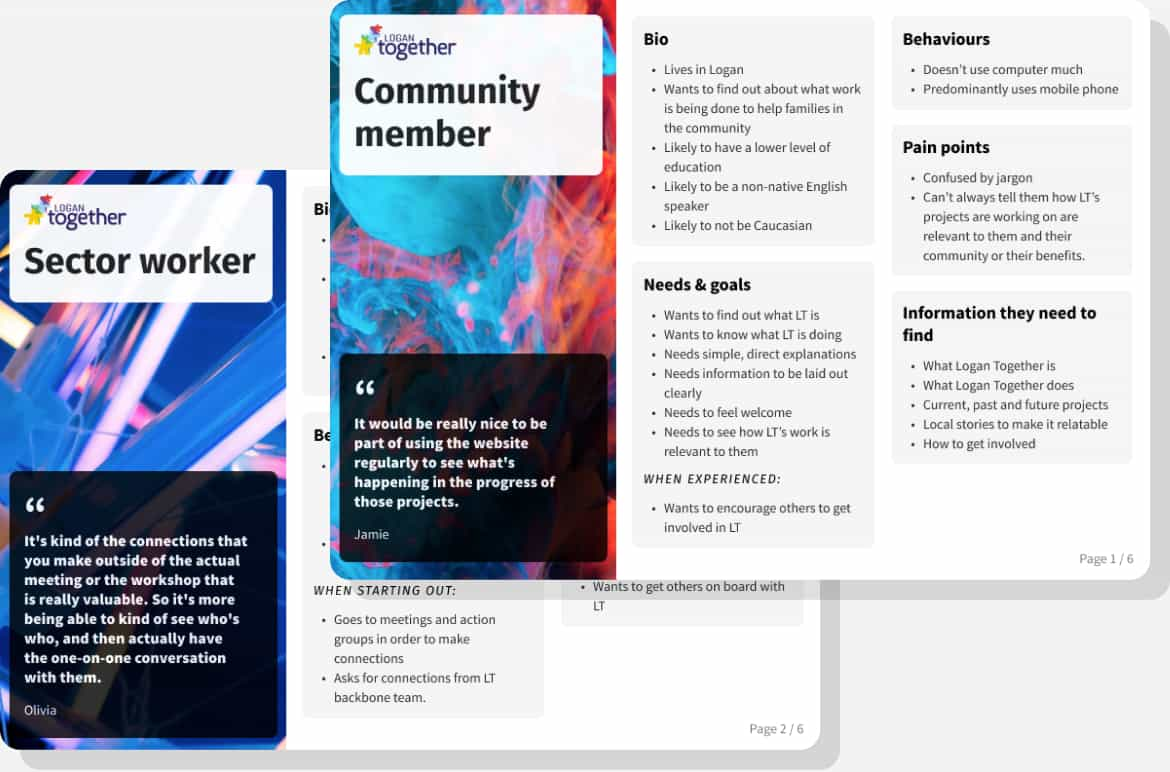
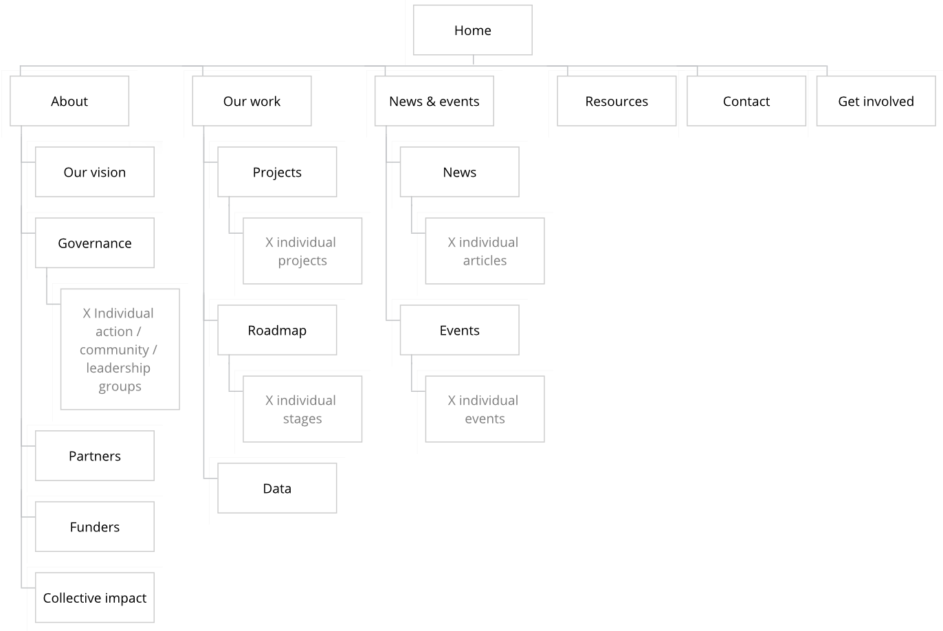
Improving the information architecture
I catalogued every piece of content present on the site with a content audit to help me create a new, more coherent information architecture. In addition to duplicated and hard-to-find content, many pages had simply been forgotten about and were several years out of date.
I also asked 6 sector workers and community members to complete a card sorting activity. This gave me insight into how these personas grouped content together in a way that made sense to them.
These two artefacts allowed me to create a new sitemap which:
- Structured information in a way that’s intuitive for users
- Prioritised content based on Logan Together’s goals
- Removed duplication of content
Improving page structure
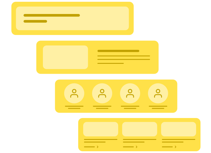
Almost all of the content on Logan Together’s website was formatted as a single block of text.
We decided to lay out each page using reusable components to help users scan through a page’s content, with the aim of making it more structured and less overwhelming. We also hoped this would help users find what they were looking for more easily and reduce the effort required in development.
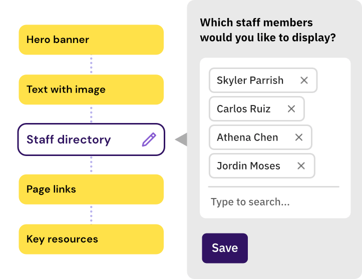
Rebuilding the back end
To make the backend easier to manage, we built it as a series of reusable components to break up the different options available into logical sections.
This made the backend more flexible, as content editors could add, remove, and rearrange blocks within pages to accomodate for the organisation’s changing needs.
To reduce the amount of duplicate content, we took a relational approach to managing the data, ensuring that if a piece of information was shown in multiple places, it came from one single source. This would make the website less prone to becoming out of date because content no longer had to be updated in multiple places.
Lastly, to make the website more accessible for all user groups, Lucas took measures to increase the page load speed on mobile and desktop in the new website build.
4Testing and prototyping
Iteration 1
The initial prototype
I produced two low-fidelity prototypes - one for desktop-based sector workers, and one for mobile-based community members - which aimed to:
We decided to lay out each page using reusable components to help users scan through a page’s content, with the aim of making it more structured and less overwhelming. We also hoped this would help users find what they were looking for more easily and reduce the effort required in development.
- Make the website easier and more intuitive to navigate
- Use new content to explain more clearly what Logan Together is, its goals, and how it works
- Provide more information about Logan Together’s projects
- Show the progress the organisation has made with data
- Advertise current opportunities for people to get involved with the movement.

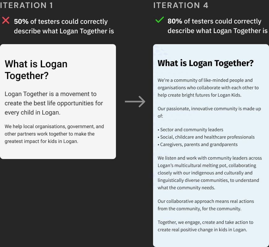
Testing and iterating copy
Our first round of testing revealed that community members were confused by the indirect language and jargon which Logan Together used in their copy.
I worked with the client to iterate on the key pieces of copy which describe what Logan Together is and the work which they do, testing each iteration until it was more widely understood.
I also produced a copy guide with detailed feedback from testers for Logan Together to use when writing content about their projects, to help them produce copy which was easier to understand for users.
Making it easier to contact a member of the backbone team
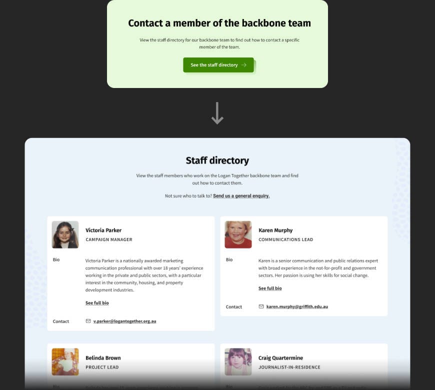
"I’d go contact? I would look there... I couldn't find them. I'm stuck now."
During testing, sector workers struggled to work out how to contact a specific person on the backbone team. They would often go to the “Contact” page and get stuck.
To alleviate the problem, I added a component on the "Contact" page which linked to the “About > Governance > Backbone team” page containing information on each member of the team.
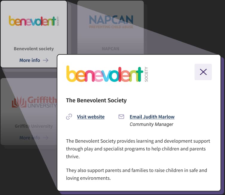
Helping sector workers connect with each other
During testing, we discovered that sector workers work more effectively when they can connect with others who are working in a similar area to them.
For each organisation on the "Partners" page, we added a bio, contact details, and a link to their website to help sector workers discover and connect with each other.
"Being able to see who's who and have a one-on-one conversation with them is really valuable."
Iteration 4
Features of the final prototype
Explaining what Logan Together is
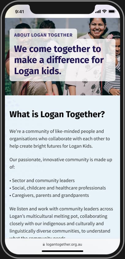
By the fourth iteration of copy, testers successfully understood that Logan Together was an organisation which brings together professionals and the local community to help improve the development of Logan kids.
"It's like a one stop shop for all of those people to come together and help the children of Logan."
Showing the work that Logan Together does
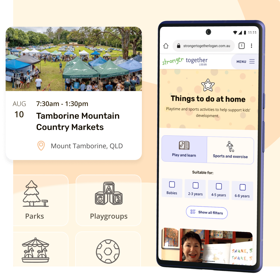
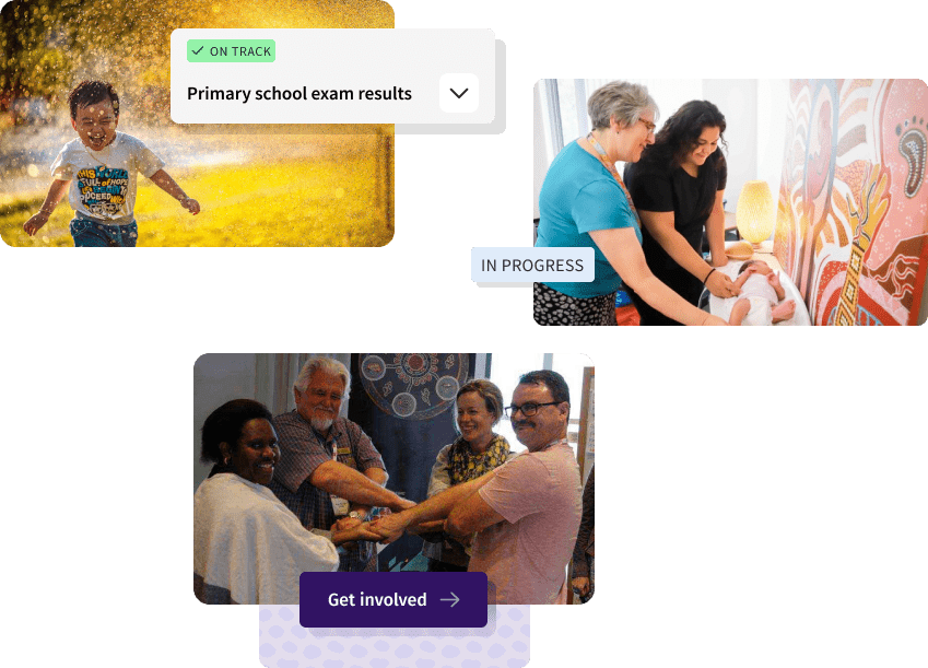
The best way to explain what Logan Together does was to show the projects they’re involved with.
We gave each project a simple, goal-oriented title to communicate the impact it has. We found that the projects appealed to both community members and sector workers alike.
"I feel like this shows a really nice example of what makes Logan Together."
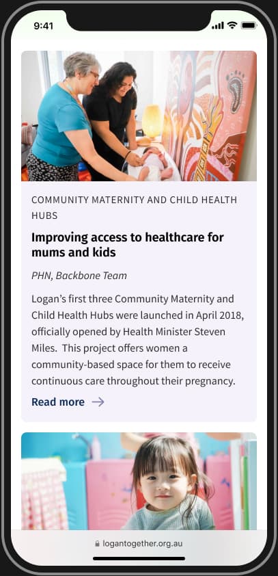
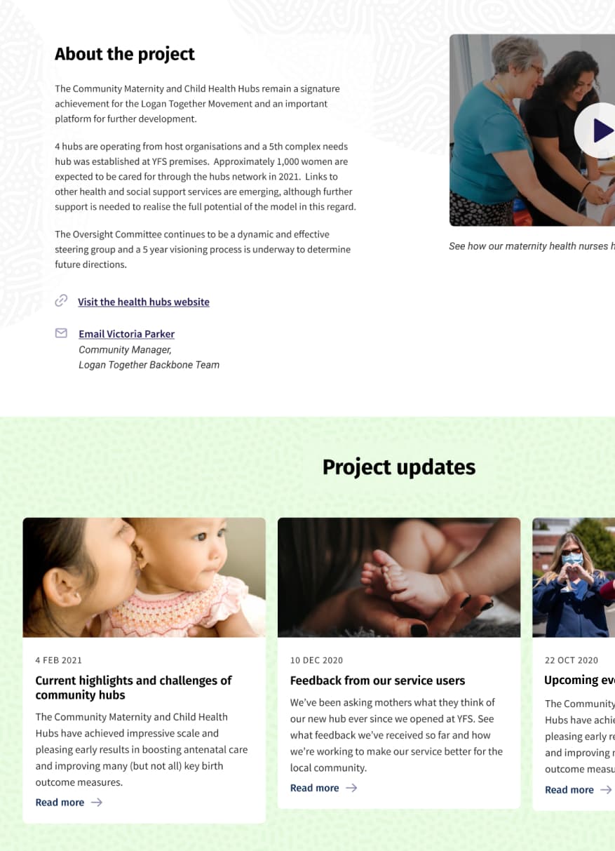
Information on projects
To showcase the projects Logan Together support, we gave each project its own dedicated page. These pages were designed to explain what each project is about, show updates on how it’s going, and provide links to find out more or to contact the person in charge of the project.
"See, this is really good. I would use this for some of the stuff that I do in my job. That's really handy to me. And I would probably visit the health hub website."
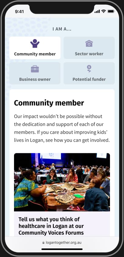
Getting involved
Logan Together wanted to make the movement more accessible for community members to join. We created a “Get involved” page which shows how community members can help Logan Together with their current initiatives.
"There's all the different ways you can get involved, which is really cool. There's not just one way of being involved in it."
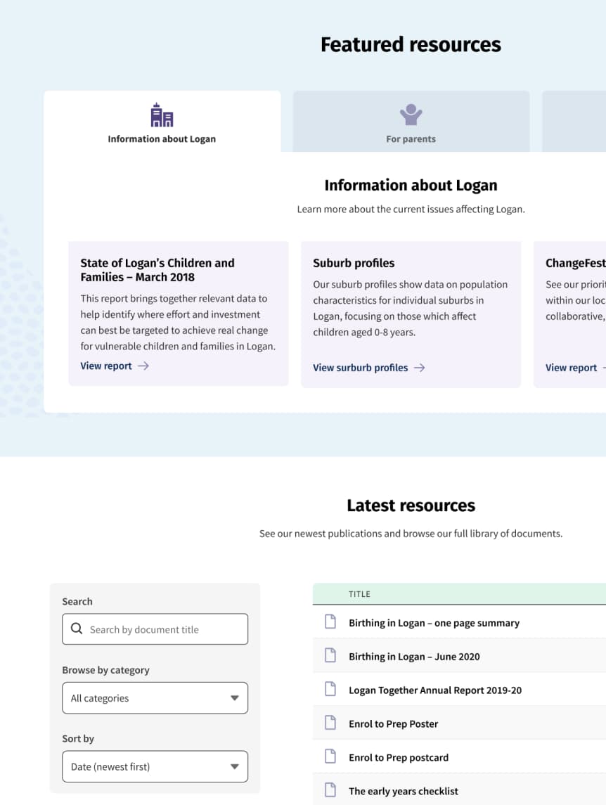
Easy access to key resources
The old Logan Together website listed resources under 15 different arbitrary categories, which sat unsorted on the page, and without any way to filter them.
Our research showed that sector workers wanted to be able to see the most recently uploaded resources, so I created a “Latest resources” section which sorted all resources by date, with the option to filter by category and search through the list for specific items.
On top of that, sector workers said there two key documents which they would refer to time and again. I put these at the top of the page in a “Featured resources” tabbed component, giving Logan Together the opportunity to build this out as the movement progresses.
“That’s exactly the kind of thing I would be looking for in the Resources section."
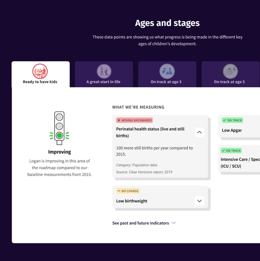
Showing progress towards improving child development
Logan Together measures their progress towards improving child development through a series of defined metrics. Government bodies and funders need visibility of these metrics so that they can monitor the movement’s impact.
To meet this need, we designed a “Data” page that shows:
- Which data points are being measured
- How the data points are trending
- How the movement is tracking in each of their target areas
Final prototype
“The pictures are more reflective of the community of Logan. So I'm very happy about that.”
“It's much cleaner, less cluttered than the current one. It seems to be much simpler.”
“It looks very inviting.”
“It's much easier to find pieces of information. They’ve obviously put a lot of work into thinking about how it’s organised”
Outcomes
I really enjoyed working with Chris. He was knowledgable and made the whole process very easy. His research helped me 'sell in' concepts to my organisation, making the final product exactly right for the audience!
After presenting the prototype and testing feedback to the stakeholders, they were excited to proceed with the project build.
Lucas developed the website in WordPress and we provided Logan Together with a guide on how to add, remove, and manage content in the backend. We produced video walkthroughs and written steps, and organised all the content in a Notion microsite.
We also helped migrate old content over, and Logan Together populated the website with information on the projects they were involved in. However, after a change in leadership, unfortunately the new site was not launched live.